Insights
JupiterOne's Insights dashboards enable you to visualize your data in a variety of meaningful ways. JupiterOne offers both a comprehensive set of managed dashboards that provide immediate value. With the ability to customize and curate your own dashboards and widgets, you are able to parse your data and visualize it as you see fit.
All dashboards are powered by JupiterOne's query language, J1QL. By leveraging queries, you can visualize the query results in a variety of ways–allowing you to make powerful representations of your data quickly.
Accessing Insights
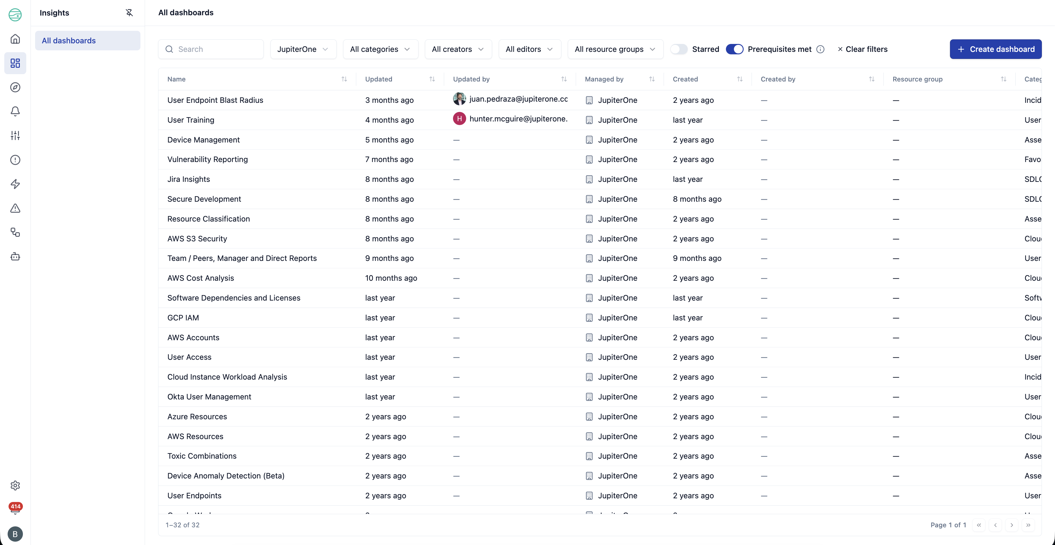
By navigating to the Insights section of your JupiterOne workspace, you will find a list of JupiterOne's managed dashboards. These dashboards come pre-configured to provide a baseline of useful visualizations that can be built upon. Note that the list of managed boards is filtered down to show you only those boards that relate to your account's configured integrations (See Managed Dashboard Prerequisites below).
Managed Dashboard Prerequisites
By default, JupiterOne filters the list of managed dashboards that you can see to the ones that relate to your account's configured integrations. If you have the AWS integration enabled, then you will see all of the dashboards that relate to AWS and cloud computing.
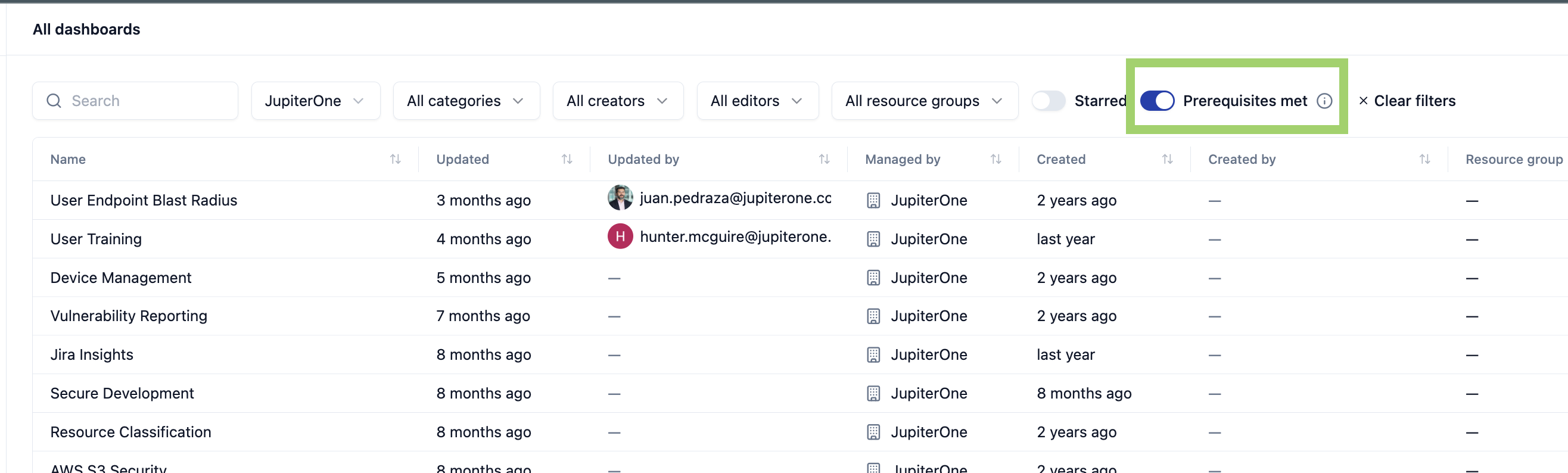
If you'd like to see all managed dashboards, even the ones that do not relate to your integrations, you can change the filter at the top of the dashboards list page.
Satisfying Prerequisites
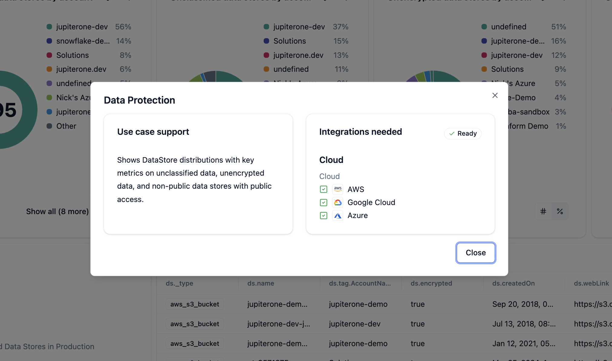
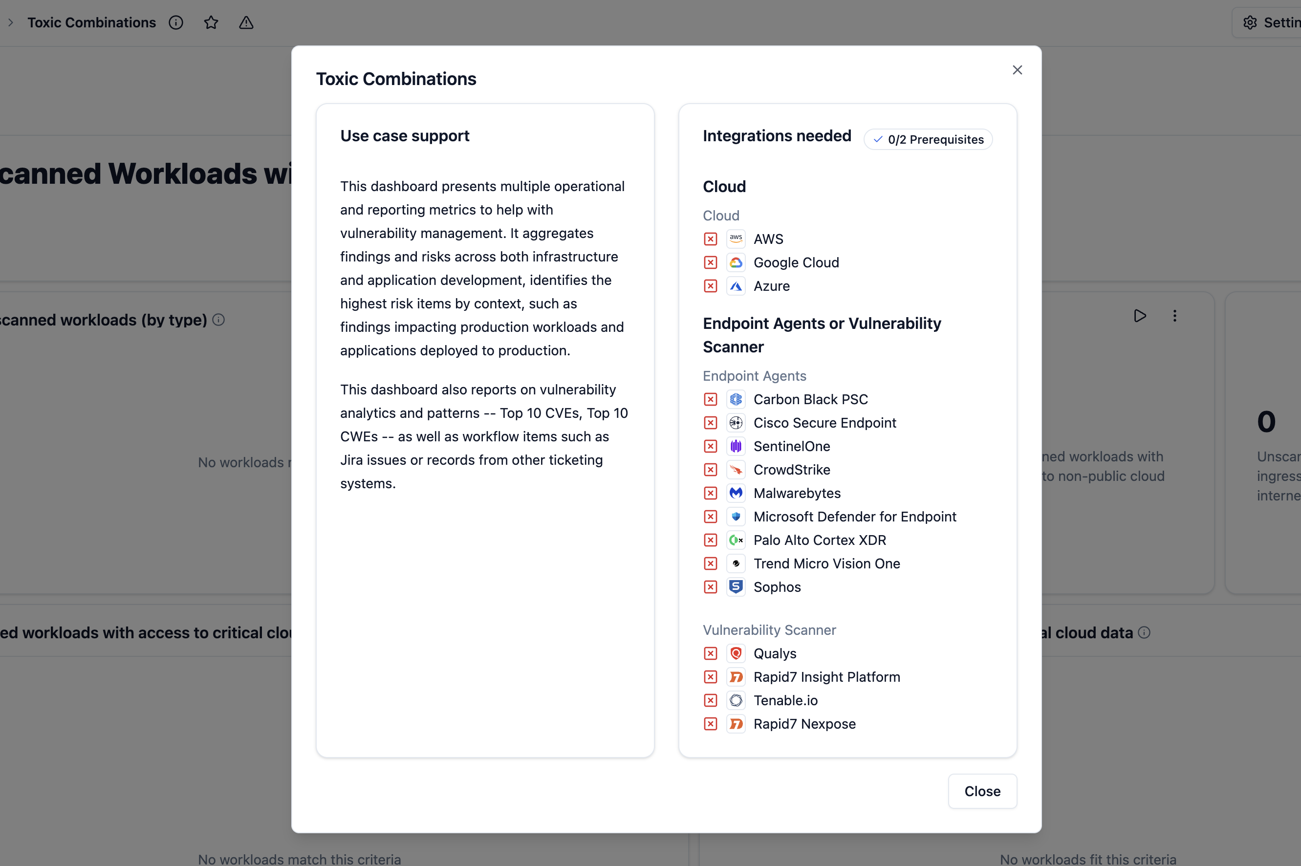
Almost every managed dashboard has a set of integrations or integration types that an account should have in order for them to gain insights from a particular dashboard.
You can see that this account meets all of the requirements for the Data Protection dashboard. It needed to have either an AWS, Google Cloud, or Azure integration set up, and it has all three.
In comparison, you can see that this account does not meet the requirements for the Toxic Combinations dashboard. It needs to have the following integrations in order for this dashboard to provide useful information to the user, one of three cloud integrations and an endpoint agent or vulnerability scanner integration.
Creating dashboards
When creating Insights dashboards, there are two main options: Creating a Team dashboard or creating a Personal dashboard. Team dashboards are accessible to all members of your workspace, while a Personal dashboard is only visible to you. Team dashboards can further be limited to a specific resource group.
To create a new dashboard:
At the top right of the dashboards list page, click Create dashboard and choose whether you want to add a personal or team board. You can also select a resource group to limit access via RBAC permissions.
Widget options:
When creating a dashboard, there are several options for widgets to choose from. This allows you to utilize the most impactful visual representation for your data. Below are the following supported dashboard widgets:
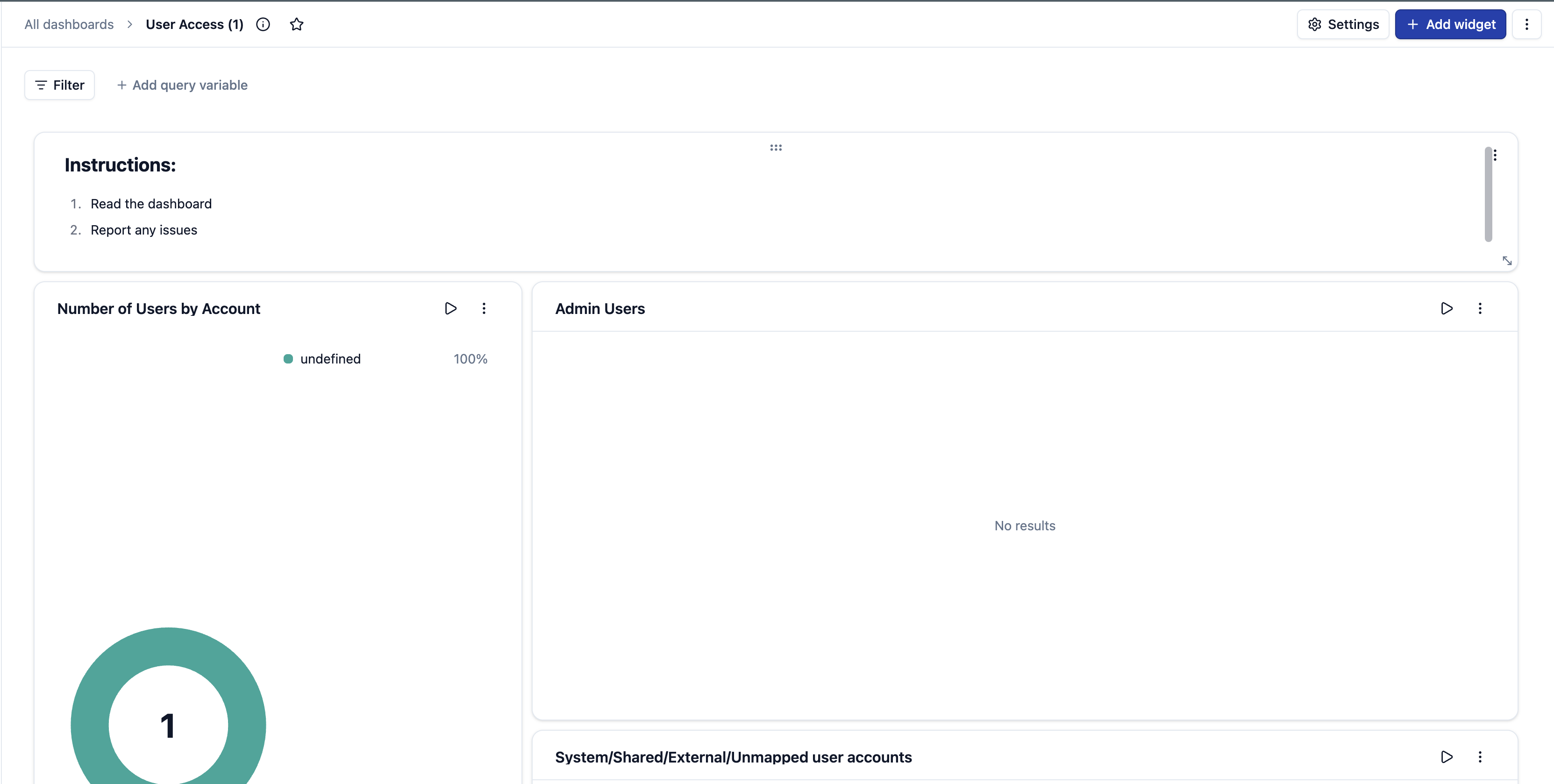
- Number: A metric chart visualization that shows one large stat value. You are able to configure color coded thresholds that will help you tell a story of good vs bad results.
- Pie Chart: The pie chart displays values from one or more queries, as they relate to each other, in the form of slices of a pie. The arc length, area and central angle of a slice are all proportional to the slices value, as it relates to the sum of all values.
- Line Chart: The line chart is created by plotting a series of several points and connecting them with a straight line.
- Bar Chart: The bar chart visualization allows you to view categorical data to analyze your queries with a specified x and y axis. You are able to run multiple queries and visualize the bar chart in stacked format.
- Matrix Chart: The matrix chart is used for analyzing and displaying the relationship between data sets. The matrix diagram shows the relationship between two, three, or four groups of information.
- Table: The tables chart present data in as close to raw form as possible. Tables are meant to be read, so they are ideal when you have data that cannot easily be presented visually, or when the data requires more specific attention.
- Graph: The graph chart displays a tree graph of query results. This chart is best used to visualize specific relationships between entities.
- Status: The status chart displays a visual summary of correlating queries. This chart is best used to show positive or negative results based on if relationships are present in query results.
Trend Widgets:
Insights, in addition to its point in time widget options, provides several options to visualize trends through widgeting. These widget types can be found in the widget selection process under Trend Widgets. The trend widgets collect the query result on a daily interval. As J1 collects the data for your query over time you are able to track and visualize the data trend between a (1W | 1M | 3M | 1Y) interval.
- Number: The metric chart visualization shows one large stat value. In the trend version of this chart you are able to track the value through a spark line to see if the result is getting larger or smaller over time.
- Pie Chart: The pie chart displays values from one or more queries, as they relate to each other, in the form of slices of a pie. The arc length, area and central angle of a slice are all proportional to the slices value, as it relates to the sum of all values. This type of chart is best used when you want a quick comparison of a small set of values in an aesthetically pleasing form. In the trend version of this chart you are able to track the value change of each slice value as well as the total value through a a spark line to see if the data set is getting larger or smaller over time.
- Line Chart: The line chart is created by plotting a series of several points and connecting them with a straight line.
- Bar Chart: The bar chart visualization allows you to view categorical data to analyze your queries with a specified x and y axis. You are able to run multiple queries and visualize the bar chart in stacked format. This chart is best suited for categorizing your results. In the trend version of the chart you are able to visualize the value change of each categorical result through a %Change indicator and a reference category bar of the result value from the previous time period selected.
- Area Chart is coming soon! Today the best way to bring an Area Chart Trend to Insights is through a Question.
Currently, widget previews are enabled for trend charts, but they show the non-trend version of the chart.
Query variables are not supported in Trend Widgets at this time
Adding charts widgets to an existing dashboard
Aside from creating completely new dashboards within Insights, you are also able to add charts to an existing dashboard.
Not all dashboards can have additional widgets added to them. Depending on your user permissions, you may or may not be able to add widgets to existing team dashboards. JupiterOne managed dashboards do not support additional widgets. You can duplicate or clone a managed dashboard to edit it.
Adding Markdown blocks
You can also add markdown-based widget blocks within a dashboard. This can be useful in bringing in external information, such as text, images, or links to additional resources. Anything supported by markdown can be embedded within this widget and added within a dashboard.
To add a markdown widget, select Add markdown option from a dashboard's additional options menu. It will open a markdown editor for you to input your content.